Forum - View topicANN 5.0 Beta
|
Goto page Previous 1, 2, 3, 4, 5, 6, 7, 8 Next |
| Author | Message | |||
|---|---|---|---|---|
Polycell
 Posts: 4623 |
|
|||
|
Well, it looks like my browser slowness issue is really caused by whatever JavaScript kicks in when you see the sidebar - disabling it fixes that issue, but then I have the bar randomly crushing my post box way the hell over.
|
||||
|
||||
marie-antoinette
 Posts: 4136 Location: Ottawa, Canada |
|
|||
|
I've checked out the beta a few times but I find it really hard to decide what to focus on for the main page. I think perhaps some differentiation in image size might be nice, like having the news items have smaller images while the columns/features remain the size they are now. I did try out the different view options but since I actually do like the images, it wasn't exactly what I wanted.
I also will definitely be turning off the sidebar for the forums to get them to be the size I want. Other than that, things look pretty good. Definitely better than the last time I checked things out. |
||||
|
||||
chronium
 Posts: 289 Location: Canada |
|
|||
|
Please have list view as the default layout for the people like me who don't keep cookies. The other 2 layouts are horrible because they pack in so much content that it removes all flow to the website I end up having no idea where to begin to look.
|
||||
|
||||
|
Dan42
Chief Encyclopedist
 Posts: 3782 Location: Montreal |
|
|||
|
A little update:
1) I recently added icons at the upper right of the sidebar, to toggle images on/off and to minimize the sidebar (goes to the bottom of the page, where it can be un-minimized) 2) I just added a "list with images" mode on the frontpage |
||||
|
||||
Giolon
 Subscriber SubscriberPosts: 59 |
|
|||
|
I really like the list new with images view. I just found the grid too hard to read - too many dimensions to scan for content. Now I can just go down the list and still have the snazzy photos.
However, some forum feedback: it's too narrow. When I'm viewing the main page, I'd say that (including the sidebar), the site takes up about 80% the width of my screen. On the forums, it only takes up about 60% total. My screen resolution is 1920x1200 on IE10. |
||||
|
||||
|
Polycell
Posts: 4623 |
|
|||
|
There's a setting that lets you double or triple the "but guys, SCIENCE!" width - double fit my 1680x1050 screen best, so I'd think triple should work just fine on yours, unless we have rather different text size settings.
|
||||
|
||||
|
Dan42
Chief Encyclopedist
Posts: 3782 Location: Montreal |
|
|||
Sorry, but if you insist on not keeping cookies you have to be prepared to live with a few inconveniences. I don't think we'll be changing the default.
Using 100% of the screen width is not necessarily good design. Personally, now that I've gotten used to the generally narrower width in ANN 5.0, when I go back to the wide old design I just think "ergh! I can't believe I tolerated this ugliness for so long." But like Polycell said, you can go to your account settings and select double or triple text width. |
||||
|
||||
|
Dan42
Chief Encyclopedist
Posts: 3782 Location: Montreal |
|
|||
|
I just went back through the entire thread so see if I missed anything and found one.
I just tried that. (bolding the title of the article)
The arrow indicates where to click to pin the menu down, and the 'x' indicates where to click to close it. I might change the arrow to a pin icon, but I think it's important in user interface design to have something that indicates these actions expressly and not just rely on the user to guess. Even if it looks "old school". --------- If someone has an issue that I didn't respond to, please re-post it. |
||||
|
||||
The King of Harts
 Posts: 6712 Location: Mount Crawford, Virginia |
|
|||
|
Has there been any progress on fixing whatever bug there is with Opera, which was first brought up here.
When I do 100% zoom I get that crazy lopsided look, but when I go to 110% (my default) the page breaks and part of the right side is off screen. Granted, it's only the other white border, so no text is cut off, but I figured I should still bring it up since it's not a problem for any other website/forum since they just readjust no matter how much it's zoomed in. 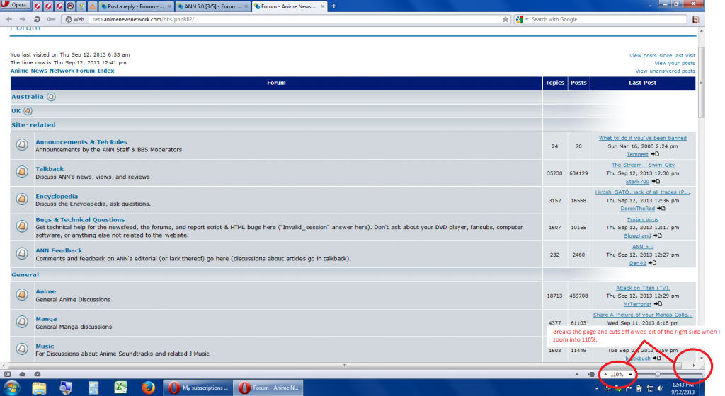
|
||||
|
||||
|
marie-antoinette
Posts: 4136 Location: Ottawa, Canada |
|
|||
|
List View with Images looks great, pretty sure that's the view I'll be using when the site switches over.
I still think the forum view needs some work though. I had thought the forum would get larger when the sidebar was turned off but this is not the case. I know I can change the width for my account but I honestly don't see much point in the forums changing size. There's just a lot of white space there ... Which brings up another concern, because that's going to be one really big ad there, assuming you are still planning on running ads in that way. |
||||
|
||||
jsc315
 Posts: 925 |
|
|||
Agreed. On my iphone and ipad and other handheld devices the site looks great and the forums scale properly and look great. Though on a large to huge monitor in high resolutions it just looks cramped and small. The forums just do not scale well at all on larger screens at all. I actually have a much easier time reading the forums on my iphone then I do they way they are now. Maybe it's just me and a few people complaining but does that not say something is wrong then if i can read the forums much easier on smaller device but when scaled up it feels like I am reading it through a view finder. |
||||
|
||||
|
Dan42
Chief Encyclopedist
Posts: 3782 Location: Montreal |
|
|||
|
You prefer text to fill the screen. I understand that. Really I do. But most people prefer text to be not too wide. Including me. Even though I have a 1920px wide monitor. But remember that you CAN make it the way you like by choosing the text's width in your account settings. It's not like this is out of your control, right?
|
||||
|
||||
|
Giolon
Subscriber Posts: 59 |
|
|||
I didn't know about that option so I went and took a look. I agree that running text across the entirety of the screen is not good, but here's the thing - because of the sidebar, the forum content itself doesn't use the whole screen. The sidebar takes 315px (16%) no matter what, and on normal width, the forum content takes up only 765px (40%), and the actual content takes up even less because the author column is taking up part of it. You've got nearly half of my screen filled with wasted blank space. On double-width, the forums take approx. 1415px (74%), which is more than the main page's primary content column which takes up 1175px (61%). I really dig that width, and I've love it if I could use it on the forums and while reading articles. 1415px is too wide, and 765 isn't enough. That 1175px of the main page feels just right to me. I won't try any harder than that to change your mind. It's your guy's site, and you can design it how you like. I, as a reader, am just trying to give you feedback that I think your available options right now are too drastically far apart from each other. Thanks for listening, even if you end up ultimately deciding not to change anything. I'm sure I'll figure out one of the available options to adapt to. |
||||
|
||||
Tempest
 I Run this place. I Run this place.ANN Publisher  Posts: 10421 Location: Do not message me for support. |
|
|||
Could you tell us what browser / OS you are using? I'd like to look into that slowness issue. |
||||
|
||||
|
Dan42
Chief Encyclopedist
Posts: 3782 Location: Montreal |
|
|||
Hmm, interesting. So you'd prefer the text to be wider but DON'T want it to fill the screen. I hadn't considered that, althought it's obvious now if I think about it. I'll see what I can do. |
||||
|
||||
 |
All times are GMT - 5 Hours |
|
|
|
Powered by phpBB © 2001, 2005 phpBB Group