Review
by Rebecca Silverman,D.Gray-man Illustrations
Artbook
| Synopsis: | 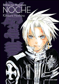 |
||
Katsura Hoshino presents the color artwork of her series D. Gray-man from its beginning through 2010. She discusses her feelings about each piece and shares some photos of her workspace and cat. Also included are two moderated discussions with other mangaka. |
|||
| Review: | |||
First things first – take off the dust jacket. Printed underneath on the incongruously hot pink covers are some of Hoshino's sketches. While less impressive than the color artwork inside, real art geeks will appreciate the chance to see her actual lines devoid of distracting colors and pre-clean up. Not that art fans will be disappointed with the rest of the selection within the book – Hoshino's art is compositionally interesting and has a watercolor quality that only a master with the markers can achieve. There are no dull pictures here. Hoshino varies her compositional style with each image, creating a carnival effect to the book as a whole. I do not mean “carnival” in the sense of a fun place to have a good time, but rather as Mikhail Bahktin, the father of carnival theory and the idea of carnivalesque, intended. What this implies is a frenzied pace of sinister imagery with manic colors perfectly in keeping with the overall tone of the series. It also ensures that the viewer never gets bored when turning the pages. Each composition is unique and you never feel like you are simply looking at multiple versions of the same image. Hoshino admits in one of her discussions (included in the back of the volume) that she has a symbolism to each picture, a puzzle if you will. Readers familiar with the characters can attempt to solve these mysteries, although you should be warned that she provides no answer key. The literal idea of a puzzle shows up as theme in her work. Actual jigsaw puzzle pieces make up a few of the images and many other pictures have a quality of dissolution, with the characters slowly vanishing from the ground up. This is mimicked by the images with puzzle pieces, where the pictures are coming apart. This is better shown in her hand-colored pictures; fortunately very few images are fully digitally colored. Hoshino states that she prefers to color with Copic markers and she has a deft hand with them. In fact it is in her use of color and her technique in coloring that she shines as an artist. This is best seen in her human figures. While her sense of anatomy is fair, her characters are quite plain by manga standards. It is the application and selection of color that give them personality in their still shots. The image of Lenalee on page 43 is a particularly good example of this. The pose, Lenalee sitting on the bank of a body of fresh water, is a common in the art world. However, the dissolution effect at the base of the picture starts to give it a unique feel. The color adds depth and texture to the otherwise bland piece and shows the ink bleeding into the paper, giving it a more traditional feel. Thus is a basic pose of a standard pretty manga girl transformed into something more remarkable. A couple of specific images deserve mention. The first is on page 21 – Road sitting on a doll's head. While not a pleasing picture, it is striking. At first it simply looks like a creepy Goth girl sitting on a head, but upon closer inspection you see that Road's legs begin to unravel into the tattered ends of the doll's hair ribbons. The colors are almost exclusively black and white with the exception of Road's hair, eyes, and the doll's eyes and ribbons. This brings the doll's head out in a sinister way that lends the whole picture an air of menace. It is also worth noting that Road's stockings unravel more and more the closer to the ribbons that they get, speaking to the puzzle that Hoshino alludes to. The other picture that should be noted is on page 65, an image that Hoshino herself has mixed feelings about. Part of what is so remarkable is that this piece is unfinished. This fact actually makes it all that much more intriguing. The sparse use of color adds to the horrific nature of the piece, as the woman is attacked by a skeletal crescent moon while her legs unravel into white (that is, nothingness) instead of black, which implies the existence of something. Until reading the artist's comments, it is nearly impossible to tell that the picture is unfinished. While Hoshino herself may not have cared for the image, her unfinished work remains compelling and some artists would argue that it is among the best pieces in the book. Hoshino does have her problems as an artist, of course. In some pictures she overloads the color, leading to a sense of drowning in a psychedelic pool of ink. As has been mentioned, her character designs are simple, at times to a fault. One could argue that her motifs are overused, although they are well done. The two conversations in the back are interesting, although the reddish ink in which they are printed makes for slightly difficult reading, at least if your eyesight is less than perfect. The first discussion with Osamu Akimoto, mangaka behind the long-running Kochikame, is less enjoyable because of the way he talks down to Hoshino. He makes veiled (or vaguely, depending on your interpretation) misogynist remarks about her being a “fragile” female and exudes a general sense of his own superiority. The second conversation with Death Note's Takeshi Obata is more about the differences in the way the two create manga. She has a clear worship of his art which plainly makes Obata uncomfortable. Following the interviews are Hoshino's notes on each picture in the book and translations of the Japanese text on some of them. You don't have to be a D.Gray-man fan to enjoy this book. While the images will make more sense if you are, Hoshino's work is attractive and artistic enough to stand on its own with no previous story knowledge. She still has room to grow as an artist, but this is overall an exquisite volume of compositionally excellent images that should satisfy the artistic soul in all of us. |
|
The views and opinions expressed in this article are solely those of the author(s) and do not necessarily represent the views of Anime News Network, its employees, owners, or sponsors.
|
| Grade: | |||
Overall : B+
Story : N/A
Art : A-
+ Interesting compositions, good use of color and specific motifs. |
|||
|
discuss this in the forum (10 posts) |
bookmark/share with:
|
|||
| Production Info: | ||
|
Full encyclopedia details about Release information about |
||