Interest
A Look Into the Art and Animation of Land of the Lustrous
posted on by Kim Morrissy
To celebrate the release of the Blu-ray and DVD versions of the Land of the Lustrous anime, the series held an art exhibit in the Marui department store in Yurakucho. The exhibit was originally planned to run from the 19th of January to the 18th of February, but due to popular demand, it was extended until the 25th. I managed to check out the exhibit during its final days.


Here is a brief summary of what was inside:
Designs of all the characters, creatures, and the Lunarians. These were all hand-drawn, with notes specifying which parts of the designs to emphasize when modeling them in 3D.
Yōichi Nishikawa's concept art. His art forms the backbone of the aesthetic of the series. Many of the shots that were actually featured in the show hewed closely to Nishikawa's work, right down to the framing and shading choices. For example, compare this shot from episode 2 to Nishikawa's drawing:


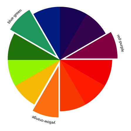
The exhibit even featured the color scripts used for the anime - that is, the directions for the coloring choices. Nishikawa explains his rationale for the colors in his commentary: “The anime has lot of open space and not many drawings, so if you mess up the colors, the entire picture will look flat.”
According to him, it's best to pick three points on the color wheel, draw a triangle to connect them, and then use The Colors Within that triangle. In other words, he recommends using triadic colors.

For example, Nishikawa didn't want to put too many shadows in this image of a sunset because that would make the shot look cold. So he used purple as a base image instead, then combined it with orange and greenish blue. If you look at where these colors lie on the color wheel, they would connect into an equilateral triangle.
You can see that black shades stand out more in the PV and other work that Nishikawa didn't directly touch.

To make the art of the anime easier to compare with Nishikawa's work, the anime background art concept designs were also displayed at the exhibit. Objects were placed in the backgrounds with the exact specifications of their size and parameters to guide the 3D modelers.
The exhibit also featured a multifaceted, glittering screen that looked like a gem. This was showing clips from the show. It was clear that this jewel screen was a big draw of the exhibit, as photos were absolutely prohibited.
I was at least permitted to take photos at this spot opposite from the screen.

Another TV screen showed the 2D “guide animation” used as a basis for the 3D animation in the series. The footage shown was of Norio Matsumoto's guide animation for the second half of episode 8. Matsumoto is renowned within the 2D anime industry for his work on standout action sequences in Naruto, and this particular sequence is bundled as one of the extras in the DVD and Bluray.

Hand-painted background art by Hisako Akagi, one of the art directors of Land of the Lustrous, were also a key part of the exhibit. Different artwork was displayed after the 16th of February; when I went after that date, I saw lots of nature shots of water, ice, and greenery from the second half of the series.
Storyboards from episode 1 were posted on the wall, along with messages from producers Kiyotaka Waki and Katsuhiro Takei. From Waki: “Making Land of the Lustrous was almost always difficult, but there were fun times to be had as well. Now that it's over, I feel accomplished but also sad.”
Takei: “Out of all the possibilities within commercial anime, we chose to make a not-quite full CG production. After all the difficulties and trials we encountered, we managed to make a unique work that you won't see anywhere else in the world. It shines as brilliantly as a jewel.”
Speaking of jewels, the actual gems that the characters are named after were encased in a glass case. I'm getting the feeling that this was a costly exhibit. All things considered, I got off pretty cheaply by paying 800 yen for admission.

Toward the end of the exhibit was a poster illustration of Diamond, drawn by Tomoko Yamada, the designer of the BD and DVD packages. This image was previously displayed at an Ink de Jet! Jet! Jet! art exhibit.
Tomoko Yamada normally works in book design; this is her first time working in anime. She had the idea of making an expensive, transparent layer to the case, modeled after a jewelry box. She left a message at the exhibit, saying, “The theme of the design is mixing ‘real’ and ‘manga’ expressions.”
Her rough designs for the BD and DVDs were laid out in the exhibit, and the boxes themselves were displayed just outside the entrance.


The Land of the Lustrous art exhibition ran between the 19th of January to the 25th of February. It was held on the 8th floor of Yurakucho's Marui department store.
For more about Yōichi Nishikawa's art and career, read our interview with him.