Forum - View topicNEWS: Clash of the Titans Posters by Saint Seiya's Kurumada Posted
|
Goto page Previous 1, 2, 3 Next Note: this is the discussion thread for this article |
| Author | Message | |||||
|---|---|---|---|---|---|---|
Dargonxtc
 Posts: 4463 Location: Nc5xd7+ スターダストの海洋 |
|
|||||
|
Don't really like them. I don't know if it is Kurumada's style to be overly simple, but more detailed and dark pictures would have suited this better. Being a fan of the original Clash of the Titans (haven't seen the new one yet), I can tell you that the pictures wouldn't even fit that picture either.
|
||||||
|
||||||
Chrno2
 Posts: 6171 Location: USA |
|
|||||
|
Ah finally. Looks great.
|
||||||
|
||||||
Tamaria
 Posts: 1512 Location: De Achterhoek |
|
|||||
It was pretty big. (Despite the opening  ) )
|
||||||
|
||||||
CCSYueh
 Posts: 2707 Location: San Diego, CA |
|
|||||
Could you at LEAST take the2 minutes it would take to pop over to a sales website to look at the covers to some of the Seiya manga to see that IS Kuramada's style? @ all the deviant art comments-- "Hello Picasso? This is Big Studio. Our director says you were a big influence on him so could you make some posters for his movie? Oh, please make sure you DO NOT use your trademark style because fans of the movie won't know it's your style because they have never checked out your ancient crap."
Yes it would fit the original. The original is a much cleaner world. The new one goes for dark & grimy. The gods are hated. They make sure to dis the little owl from the last movie. It's testosterone-driven (from the perspective of a 50 yr old gal). Sam Worthington is adequate (a couple of the Roman soldiers were hot). Like Saint Seiya, Hades is the ultimate baddie. And yes, the armor the gods are in (which maybe would have made sense to allow Kurumada to draw since the director did say they were done in Seiya's style) is very much Seiya armor. |
||||||
|
||||||
DarkCyradis
 Posts: 78 |
|
|||||
|
@Shay Guy - Actually, Saint Seiya was huge in its day throughout Asia, in several European countries, and is STILL fairly popular in the Spanish-speaking world.
I do agree that the artwork looks outdated by our modern standards (remember, Saint Seiya is over 20 years old now), but for all the old fans, seeing Kurumada's iconic artwork is very nostalgic. So actually, this was an excellent idea for a campaign from WB. What's more, since our ugly-gorilla-looking Perseus (lol, no offense, Sam) is so untrue to the pretty boy-loving Ancient Greeks, this modern look would only appeal to American/(some) Western audiences and likely alienate Japanese/other non-American audiences. So bringing in Kurumada, the champion of Ancient Greek pretty boys, to reconcile the movie's stylishly-ugly-Perseus with the Ancient Greek-related creative work that Japanese people are most familiar with was a stroke of genius on WB's part. I haven't seen Clash of the Titans myself, but after seeing the Kurumada artwork, I almost want to... even though I know the movie has nothing to do with him... ^^;;; |
||||||
|
||||||
|
kensh1ro
Posts: 16 |
|
|||||
|
Yeah, the first time I saw Liam Neeson's Zeus, I immediately thought "someone's been reading (or watching, considering how shiny his "cloth" was) Saint Seiya."
|
||||||
|
||||||
Myoubi
 Posts: 3 Location: San Pedro Sula - Honduras |
|
|||||
Hello, Where can I see or get more info about it?? Yust wana find out more about Clash of the Tytans?? |
||||||
|
||||||
littlegreenwolf
 Posts: 4796 Location: Seattle, WA |
|
|||||
His drawing style isn't my problem, it's the horrible coloring job which is NOT what I'm used to when seeing Kurumada's art. Computer coloring is nice when done right, but in these pieces it just makes the work look cheap and on the verge of unprofessional, hence the deviant art comments. It looks like someone who has just started trying out coloring with a computer. I would have loved to see him color them with the traditional water color/marker style I've seen him done before. You can't convince me that this: 
Is better than this: 
It just looks plain lazy to me. My drawing professor would throttle me if I ever tried making a background like what we see in the Titan's poster. Too much blur and smudge. |
||||||
|
||||||
Apollo-kun
 Posts: 1213 Location: City 7, Macross 7 |
|
|||||
|
I dunno, I'm a huge fan of Kurumada's work, but after seeing "Clash of the Titans", I'm not sure his interpretation of the film exactly fits. Granted, the artwork is absolutely beautiful, but it lacks the "grit" which seemed to be purposefully instilled by the directors in the film. His artwork seems more like the covers to some awesome new manga, and not the posters to a blockbuster Hollywood film. However, I respect different interpretations of things, and so I must say it's pretty cool what Kuromada has done; I just dunno if it works so well for the film.
|
||||||
|
||||||
|
CCSYueh
Posts: 2707 Location: San Diego, CA |
|
|||||
|
@Littlegreenwolf-
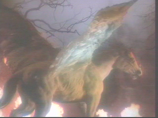
I don't think Kurumada would have made the kraken look so generically boring a monster. It looks like his style to me. I remember the bright colors, though muted, never solid like say, a shojo cover all covered in pretty people & flowers. Maybe I'm remembering BTx which had a character flying a mech that looked like a winged horse... The kraken is a water setting. Virgo Shaka's attack isn't water, it's Kaname Tousen's removal of the 5 senses. But the point really is to put this in a train car so fans can say "That looks like Seiya" & maybe want to go to the movie. It's a pr move on the studio's part to milk a few more tickets out of the movie. |
||||||
|
||||||
egoist
 Posts: 7762 |
|
|||||
|
The funny thing is that those claiming that this is a crappy painting most likely didn't watch Saint Seiya.
#1: It was made to look old, and it faithfully follows the original Saint Seiya's art(colouring included). #2: It's by no means meant to be something outstanding, but more of a nostalgia activator. #3: It definitely will work for the fans of the original Saint Seiya, and that's their goal. #4: Mission accomplished. Lastly, if they really wanted something modern and outstanding, they would have used Lost Canvas' design and art. But I bet most of you don't even know what Lost Canvas means without checking ANN's encyclopedia. |
||||||
|
||||||
|
littlegreenwolf
Posts: 4796 Location: Seattle, WA |
|
|||||
Yeah... no. There's a huge difference between traditional media and how Kurumada uses CG. I don't know what kind of computers you used in the 80s, but last I checked coloring with computers was something that started relatively recently in the 90s. It's painfully obvious he just threw the illustration through photoshop.
I knew what it was before you even mentioned it, and that point is moot because Kurumada DIDN'T do the artwork for Lost Canvas. |
||||||
|
||||||
|
egoist
Posts: 7762 |
|
|||||
Well, though they used his original concept, it wasn't him who did the art of Saint Seiya TV either. But then again, judging from the fact that you ignored all the other explanations, I'm guessing that you have a problem with the art, rather than doubting its success probability. |
||||||
|
||||||
|
Dargonxtc
Posts: 4463 Location: Nc5xd7+ スターダストの海洋 |
|
|||||
Look I haven't seen the new one, but it doesn't take a genius to figure out that it is going for a dark & grimy setting. All the more reason as to why these pictures are (at least) badly paired. Whether it succeeds or not is an entirely different matter. I am more concerned with implication that the original was cleaner. As if to say it was not made to be dark and grimy. Forgive me if this is not what you were suggesting, but that is how I read it. You have to remember that they were constricted by the technology at the time, as well as film quality. Also movies back then didn't have what seems like unlimited budgets that many seem to have today. But I don't think for a moment, keeping in mind that it was a product of the time, the producers didn't want to tell a dark tale. 
|
||||||
|
||||||
|
HellKorn
Posts: 1669 Location: Columbus, OH |
|
|||||
|
I only read about a ten volumes or so of Saint Seya, but could anyone tell me if Kurumada ever consistently draws faces that are not in a weird 3/4 view or some profile shot? It makes his skills seem, well, limited.
|
||||||
|
||||||
 |
All times are GMT - 5 Hours |
|
|
|
Powered by phpBB © 2001, 2005 phpBB Group