Forum - View topicNEWS: Clash of the Titans Posters by Saint Seiya's Kurumada Posted
|
Goto page Previous 1, 2, 3 Note: this is the discussion thread for this article |
| Author | Message | |||||||
|---|---|---|---|---|---|---|---|---|
Tamaria
 Posts: 1512 Location: De Achterhoek |
|
|||||||
|
His drawing skills are pretty limited, if you ask me. There are tons of anatomical mistakes in his works. But you don't read Saint Seiya (or any of his other works) for the art. You read them because they are mindless, kick-ass fun. I think the crummy art is part of its charm. It grows on you, just like that stupid French opening, I guess
|
||||||||
|
||||||||
CCSYueh
 Posts: 2707 Location: San Diego, CA |
|
|||||||
In the past, movies & tv often portrayed Greece & Rome as pretty tidy places. Come on, for all that traveling, Xena & Hercules looked pretty fresh every ep, didn't they? This movie is Clash of the Titans post-300.
Yes, a fantasy setting closer to Xena & Hercules in appearance.
Dark tale vs dark setting. Two different things. Trying to stack the deck much? 
Cave. Nasty monsters also. 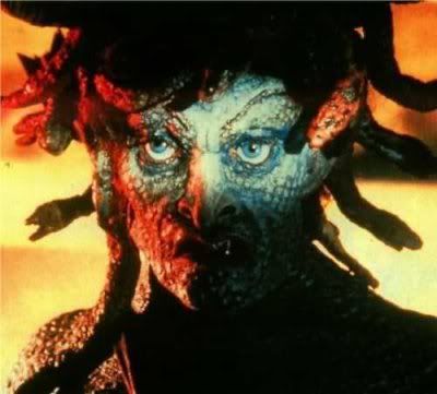
She was underground--ruins of a temple, wasn't it? 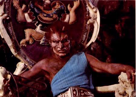
Swamp-dweller. According to IMDB he was originally fully stop motion, but they went back & added lines & an actor 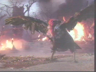
Wasn't this also the swamp?  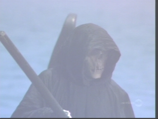
Ain't no sunshine in the underworld-at least the river Styx is never a bed of roses in anything I've seen. 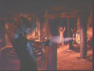
You have to admit this is pretty bright for an underground setting. Didn't Medusa keep it dark because that was to her advantage?  
More night shots, aren't they? These aren't all that grimy. The cool thing about the last one was stop motion. The rest was not really all that spectacular. I seem to recall critic snipes about the phoned-in work of the gods. (Not that they really had all that much to do, did they? Stand around. Follow Zeus's orders. Complain.) This time out the outlook is more how the gods don't help man-it should become the time of man to the exclusion of the gods. The citizens here hate the gods for the most part. Perseus doesn't want to accept any help from the gods to the point he refuses to take the sword given him by Zeus I do not recall Perseus refusing help from the gods last time out. Granted, I haven't watched it in a year, but this is one I bought on Beta, so I had to replace it with VHS & then dvd.
His skill improved as the title went along, but there tended to be only a few framable pages per volume. His is very much one where the story is the priority. I recall trudging along, turning the page to see an amazing layout of Cygnus & wondering how much the assistants helped or of he just took a couple days to really make it look amazing. I copied a full-page of the Athena Exclamation with Gemini, Camus, & Shura & have it where I can see it regularly at work because it is a nice piece, but overall, Kurumada's art isn't usually framable. I don't recall ever being impressed by his cover art (SDK has some great cover art). I do love his characters, though. The anime greatly improved/standardized the look to more his best work. I love the eyes. I see these posters as "Do it as though these were in the Seiya universe" more than actually supposed to look like this movie. Why else wasn't he given the poster with Zeus & Hades to draw? You know he could make Zeus look damned spiffy. |
||||||||
|
||||||||
 |
All times are GMT - 5 Hours |
|
|
|
Powered by phpBB © 2001, 2005 phpBB Group